Showing posts with label Decoart Modelling Paste. Show all posts

Sunday, 23 February 2014

Seashore Chocolate Box and Being Noticed!

 photo chocbboxblog5_zps05af7f04.jpg

It has been a wonderful week of unexpected pleasures!

I managed to have a creative breakthrough, which is something that provides me with a sense of zen, like nothing else! It all started with Musetouch Visual Arts Magazine sharing my Art Journal (see below), on their FB page last week. If you follow the link you'll see that the response was amazing, the photo was liked over 2000 times, and shared over 700 times! I have never had such an ego boost for my work!

The truth is that I made the art journal as part of my Uni coursework - it was a Summer project they set before starting in 2012, to create a concertina style book. I patched the cover together in haste, using Polymer clay for the sculptural seascape elements, and over time completely forgot how I did it! I wonder if this happens to other artists too ... now I try to document my process, especially as I jump about from medium to medium so often. Well, as you can see I managed to work it out this week with my Seashore Chocolate Box :) Yay!
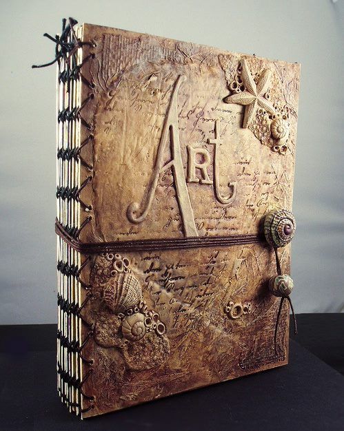
 photo chocboxblog7_zps2d464bfc.jpg
Original polymer art journal from 2012

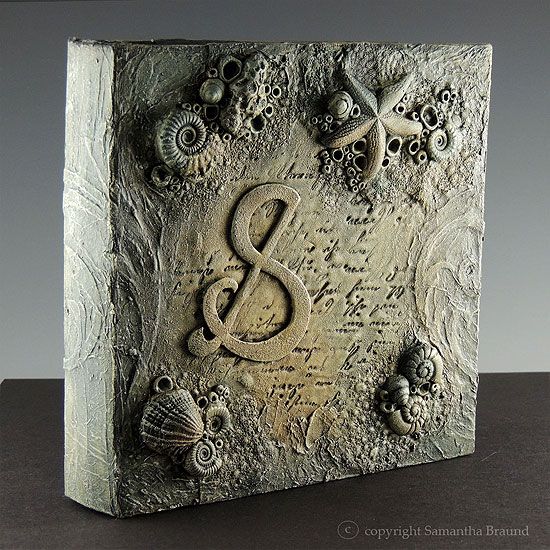
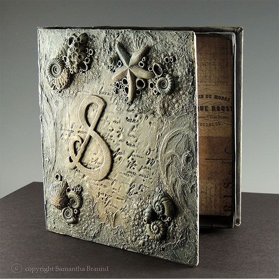
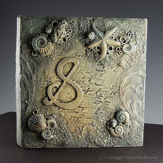
The chocolate box is for a friend who had every faith I'd be able to recall my process and tried to allay my anxieties. She wanted a coffee table book or box, and I came up with a box construction, to store her chocolate mini treats that she gets out with the coffee.

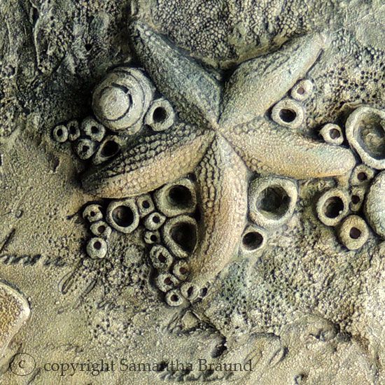
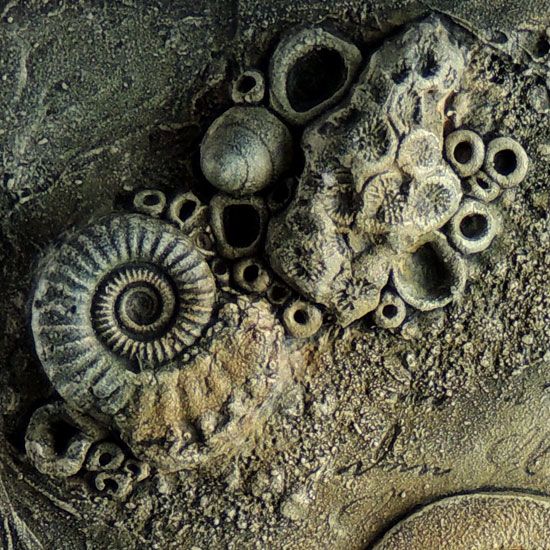
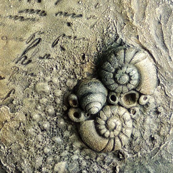
It turned out better than I thought it would. I combined polymer clay elements, Decoart Modelling paste, die cut shapes and several washes of acrylic paint to create the Seashore on the box, and added her initial to top it off. I am definitely going to make more of these for the second shop, and will try out different themes too, although I do love my Shipwrecked, pirate treasure themes in all the media I work in !

The other unexpected thrill was this amazingly complimentary write up on my metal clay work in The Polymer Arts magazine blog . My Fine silver  Purple Spider Conch Shell (see below) was featured and the author made connections between the piece and a human heart which was so insightful. It was such an honour to read, and they gave a flattering description of myself as a Multi Media Artist which did get me thinking about the way my work is developing. I cannot claim to be purely a jewellery artist that dabbles in mixed media on the side anymore, I think my condition is getting worse lol! I suspect the University course is responsible for freeing up whole other aspects of my psyche,  allowing me to explore those themes in other media

I certainly tackle issues from the past and mental health issues etc through more traditional art forms. I wonder where it is all heading?! Well, I'll be back at university this year, and will make sure I sit down with my mentor there and hash it out ....anyway I will leave you with lots of different views of the Seashore Chocolate Box and will come back with more jewellery soon, I am sure :)
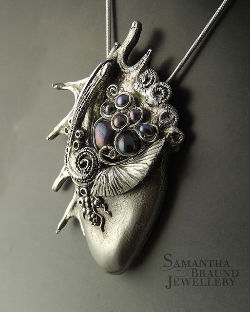

 photo chocboxblog8_zpsa8c0c7ee.jpg
Purple Spider Conch Shell in fine silver, freshwater pearls and sterling silver
(I hope to get the conches into the shop soon)
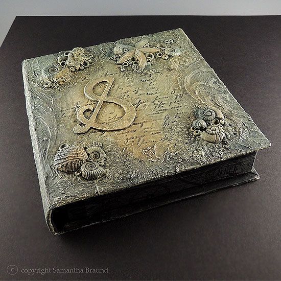

 photo chocbboxblog1_zpse50871f0.jpg
Seashore Chocolate Box


 photo chocbboxblog4_zpsbee8113e.jpg

 photo chocbboxblog3_zps4fac31f5.jpg


 photo chocboxblog6_zps0d46c659.jpg
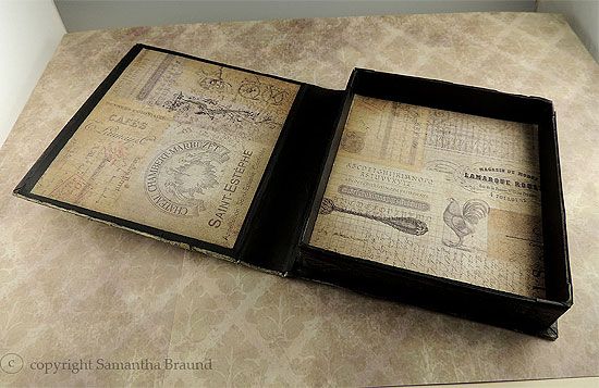
Box opened up - I used some distressed French script  paper to line the box

Close Up Views ... I love those!
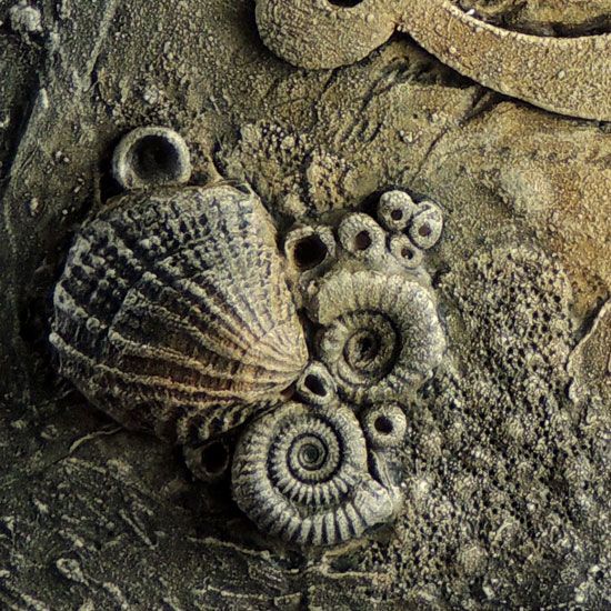
 photo chocboxblog2_zpse8ffeff1.jpg


 photo chocboxblog_zpsc7f7a126.jpg


 photo chocboxblog3_zps5455520b.jpg


 photo chocboxblog1_zps0212ec5e.jpg


I added this piece into the following challenge:
Country View Challenge #12 "Painty Pleasures"

Thanks for stopping by



Samantha Braund


Monday, 3 February 2014

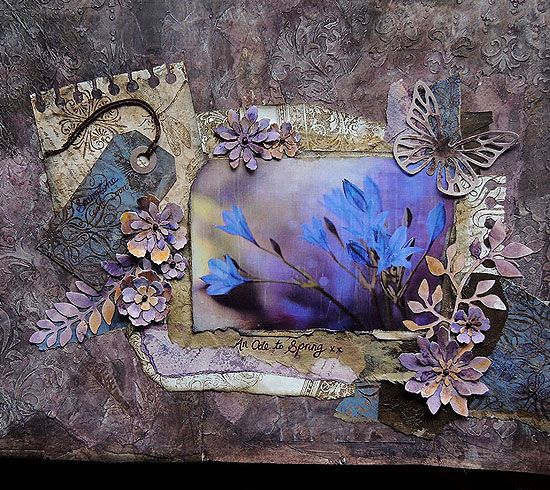
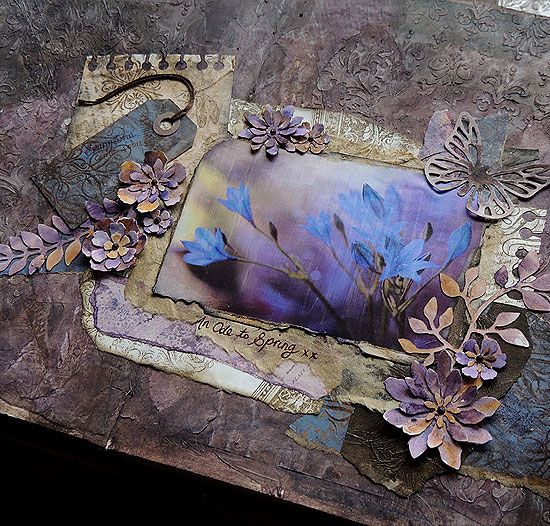
"An Ode To Spring" Art Journal Page

 photo lukepage3_zps24f47aef.jpg

I decided to take a break from the jewellery side of things this weekend. The hubby was bogged down under a pile of academic stats and figures, which left me at a loose end. I interpreted this as time for fun in the studio!

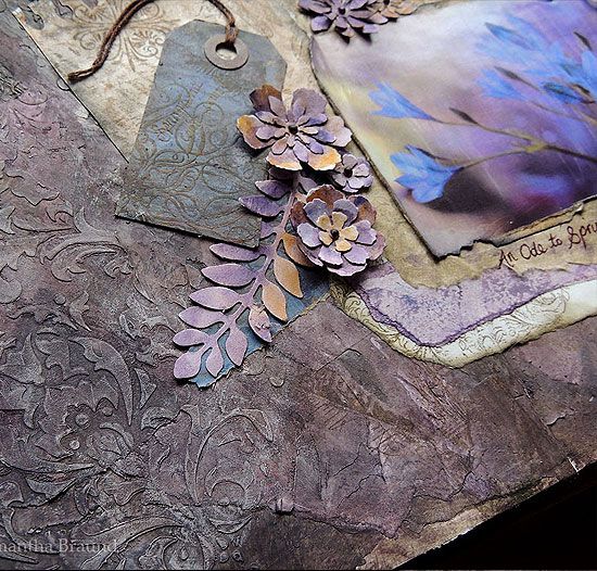
I have made a cool storage chest for my newly acquired Ink Sprays and Mists. It's all shiny and black at the moment , and in desperate need of a makeover. I want to give it a kind of heavily textured faded grungy wallpaper look, but I needed to make some practice samples first. So that was what I was supposed to do, but instead I turned to my art journal and got a wee bit invested in constructing this art journal page lol. It started as a grungy wallpaper background in purples, browns, blues and greens....then it transformed as the weekend progressed


 photo lukepage8_zps15760a3d.jpg

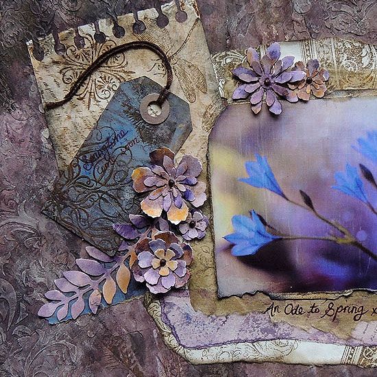
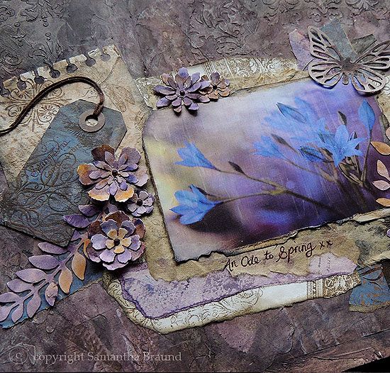
I used papers I'd printed ages ago, using the fabulous Gelli Plate. I find having a good printing session to be fun and therapeutic, and ultimately really useful. I just use "copy" paper, it's cheap and cheerful - I have a stack of these printed sheets waiting for me to use. The mood struck me to use a blue-purple print and matched it with this photo from the photographer Kasia  Pietraszko

The background was made from layers and layers of papers scraps, with gesso, acrylic paints and stencilled modelling paste. I think it does look like grungy wallpaper, so I am happy with that at least. I am still unsure about the overall composition, I got bogged down with too many options! I covered my table with stamped papers, brown paper bags, die cuts etc and became overwhelmed ...ultimately I came up with this Ode To Spring

I haven't posted up other art journal pages on this blog for some reason?! I really should pop them on here, as it is a brand new thing I have been getting into this year and would like to catalogue my efforts somewhere other than on my Facebook page lol...


 photo lukepage6_zpsc33183d6.jpg


 photo lukepage5_zpsa92d3f01.jpg


 photo lukepage4_zps6ad8c122.jpg


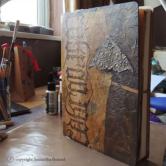
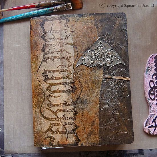
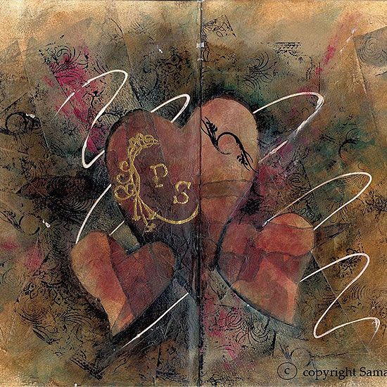
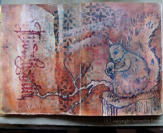
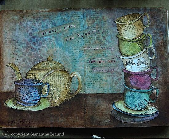
EDIT - I've amended the post to include images of my Art Journal cover, and a few pages :) I only got the journal in mid December last year, as a present, to channel any anxieties and nervous energy into...I carved my own Blackletter style stamp for the cover, and the rest of the pages shown are inspired by xmas and the hubby. Anyway, I hope you like these snapshots :)


 photo artjpages-6_zps9bdc66cb.jpg


 photo artjpages-7_zpsd64eaff6.jpg


 photo artjpages-4_zps47114d0c.jpg


 photo artjpages1-1_zps5dc056e5.jpg


 photo artjpages1-3_zpsfde78c36.jpg


 photo artjpages1-2_zps891fb3c4.jpg


Thanks so much for stopping by xx

I entered my Ode To Spring Art Journal Page into :-
"Anything Goes With Twine or String" Simon Wednesday Challenge Blog
Country View Challenges February "Painty Pleasures" Challenge  #12


Samantha Braund


Friday, 17 January 2014

Jade Gothic Book

 photo jade-gothic-blog3_zps0a3c069b.jpg

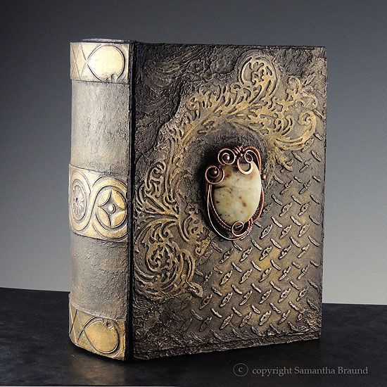
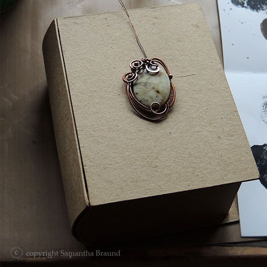
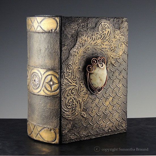
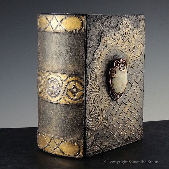
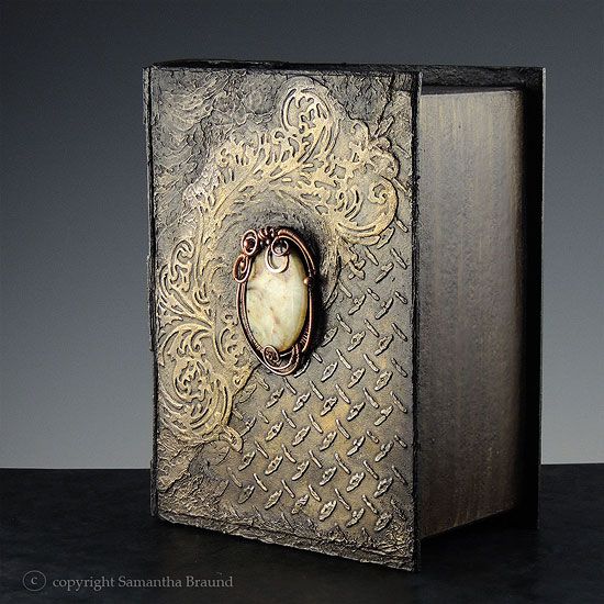
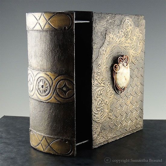
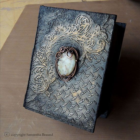
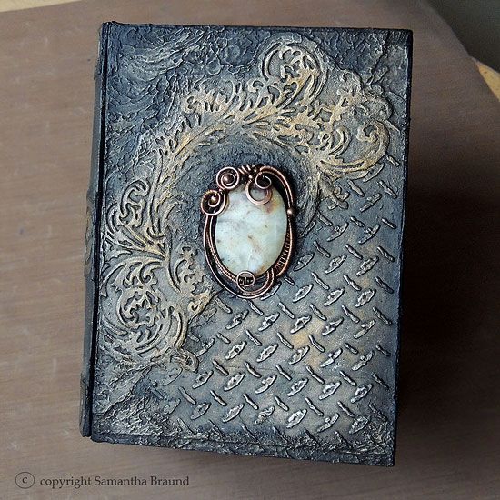
I had to share this new book I’ve altered for the hubby this week. He always complains that he can’t wear any of my jewellery as they’re too feminine for him lol. He particularly likes my wirewrapped art nouveau freestyle pieces – so as surprise I altered a papier mache “book drawer” and adorned it with a copper wire sculpted piece containing a variegated Serpentine Jade gemstone

 photo jade-gothic-blog8_zpsbd417ba9.jpg

It was a project of many firsts for me tbh. I had never used the papier mache before, it is incredibly sturdy, surprisingly so, and can take acrylic media well, but the drawer doesn’t pull in and out as smoothly as it did before I altered it. I didn’t seal it first though and did go straight in with the paint, so maybe it got a bit swollen? I don’t know, I’ll have to get a new one and experiment...

I’ve also had this jar of Decoart Modelling paste for about 6 months and had not dared use it before…I LOVE IT!! It’s so light and easy to manipulate around the piece. I smoothed the paste over cardstock containing an embossed Flourish (Tim Holtz Sizzix) . Another first for me was combining my wire sculpted work with my mixed media work…I think I will have to try more of these lol!

 photo jade-gothic-blog4_zps5c6d4d86.jpg

 photo jade-gothic-blog5_zps66e78bfb.jpg

 photo jade-gothic-blog6_zpsa9929833.jpg

 photo jade-gothic-blog7_zps328f9ab7.jpg

The rest of the book is embellished with aluminium foil pieces. I have been experimenting with inexpensive aluminium foil and various paint effects to develop a cool distressed effect. The cover has an industrial metal design, which gives it a masculine edge, and the spine reminds me of those ancient medieval books that I love. Overall, the gemstone, flourish and industrial metal elements are meant to evoke a Victorian Steampunky feel.

I just can’t wait for him to come home and see it, and hopefully he’ll find the drawer handy as a desk tidy (that desk really needs tidying!). I hope you love the photos, I noticed that the ones taken in daylight really look blueish compared to the ones taken inside my photo tent…so I included both lots for contrast.

 photo jade-gothic-blog2_zps5088b3da.jpg

 photo jade-gothic-blog1_zpsfae6a732.jpg

I will be posting these in the following contests
Simon Says ...Emboss It (Simon Wednesday Blog Challenge)  - embossed Sizzix Flourish
Our Creative Corner Blog - No More Shopping Sins Challenge - Papier Mache Book Drawer, Decoart Modelling Paste and even the Serpentine Jade gemstone which I've had since 2010!!
Ali Craft Blog - Anything Goes Challenge


Samantha Braund


Related Posts Plugin for WordPress, Blogger...